Here's a mockup showing a potential different look for Skyrim's UI. I actually really enjoy Skyrim's vanilla design! But it was a pretty marked departure from its predecessor Oblivion's, so I made something that would bridge the gap—strongly evoking Oblivion's wood and paper, but more Skyrim in its rough-hewn, dirtier fashion. The UI's design is based on SkyUI rather than vanilla Skyrim, with some tweaks.
Below we have the UI design and art I did for Spin For Good's lobby. It's a gaming site with a twist: players can play for free, but if they choose to play for cash, the money goes to charity rather than a corporation. It's a novel twist with a worthy cause, so if you're reading this you should check them out. My work consisted solely of the lobby, and not the games themselves (click the picture for more).


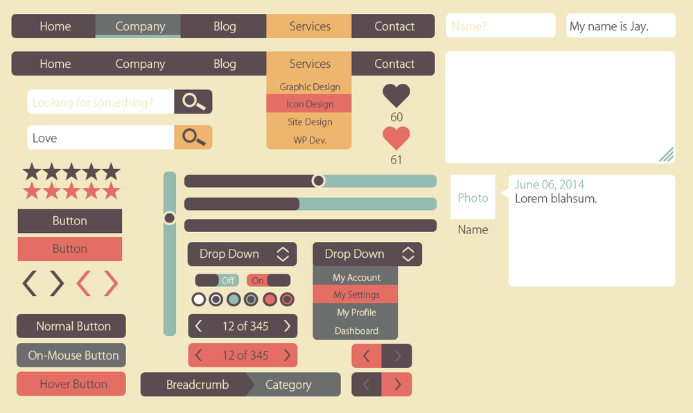
And here's a sample piece I made for myself, just trying my hand at flat UI for a website.
Below is a sample for a redesign of Pokemon X/Y's UI that I started and am currently revisiting. This interpretation is as though all the menus are part of looking at the Pokédex. (more images to come!)

A few screens from an initial version of a reskinned game for WWE. This was made following 1) a style guide provided by WWE while 2) trying to accommodate the layout of an existing game (thus some oddities in placement of items) under 3) a very tight deadline. We revised the look for the game later but I enjoyed the uniqueness of the initial style they'd set out for. (click image for more)


Lastly, here is a SWF of an interface I made for a totally different genre of game. I wanted to make something similar to Battlefield or Call of Duty with my own twist. To simplify for demonstration purposes I had most of the things that would need to be animated all set up to play at once. It may be a bit distracting but it gives an idea of how I'd like to handle different aspects of how the interface works.