Wanting to showcase more involved user interface artwork, I decided to come up with a mockup showing a potential different look for Skyrim's UI. I actually really enjoy Skyrim's vanilla design! But it was a pretty marked departure from its predecessor Oblivion's, so I made something that would bridge the gap—strongly evoking Oblivion's wood and paper, but more Skyrim in its rough-hewn, dirtier fashion. The UI's design is based on SkyUI rather than vanilla Skyrim, with some tweaks.
UI
Flat UI
Keeping on the user interface train, here's something I made to play with doing a flat UI. I wanted something as clean as possible with some character present via color.
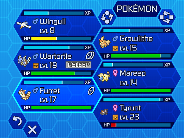
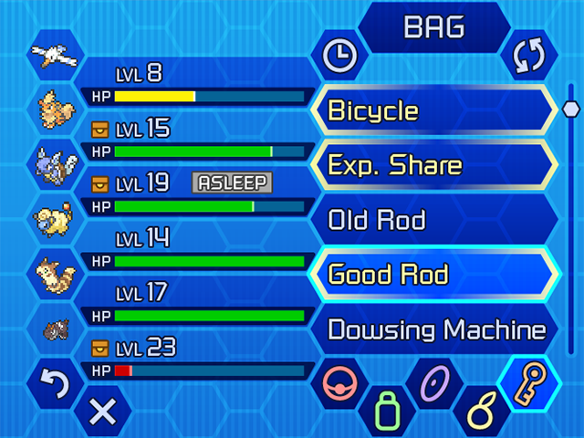
Pokemon UI teaser
I started playing Pokemon Y back in October, and while I'm playing less of it now, it still occupies my thoughts. Some of the things about the UI bothered me, so I challenged myself to handle it my own way. I've been working intermittently on it, but here are a couple completed [bottom] screens at double resolution to tease its progress; there are several others in the works, and hopefully at some point I can tie them all together in a working Flash demo... :)
Dragon's Crown UI
Having picked up Dragon's Crown for PS3 on release day, Some friends and I were playing together and found some quirks of its interface design in local multiplayer that are quite frustrating. One example is that going into shops, players must go in one at a time and handle tasks fullscreen. To us it was a huge waste of screen space and the players' time.
After we discussed how it could be handled differently, I decided to just mock up how I'd handle it. I like some of the elements of the UI but not all, so I thought I'd experiment with fonts, layout, and subtle iconography changes where appropriate. The artwork in general is lush though, and I wanted to keep it where it would still fit well. You can see what the actual game UI looks like in the photo below.


