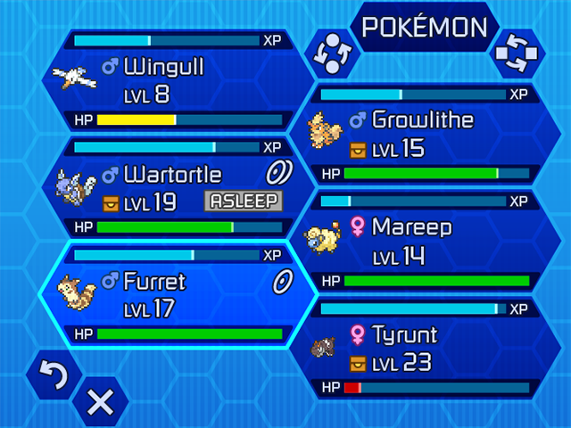
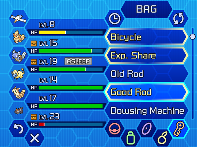
I started playing Pokemon Y back in October, and while I'm playing less of it now, it still occupies my thoughts. Some of the things about the UI bothered me, so I challenged myself to handle it my own way. I've been working intermittently on it, but here are a couple completed [bottom] screens at double resolution to tease its progress; there are several others in the works, and hopefully at some point I can tie them all together in a working Flash demo... :)
Design
Dragon's Crown UI
Having picked up Dragon's Crown for PS3 on release day, Some friends and I were playing together and found some quirks of its interface design in local multiplayer that are quite frustrating. One example is that going into shops, players must go in one at a time and handle tasks fullscreen. To us it was a huge waste of screen space and the players' time.
After we discussed how it could be handled differently, I decided to just mock up how I'd handle it. I like some of the elements of the UI but not all, so I thought I'd experiment with fonts, layout, and subtle iconography changes where appropriate. The artwork in general is lush though, and I wanted to keep it where it would still fit well. You can see what the actual game UI looks like in the photo below.
Space Birthday Poster
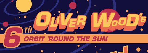 My space-themed birthday poster is finally finished. It's [fraternal?] twin was posted a little while ago and can be found here.
There's something to be said for not treating your work as precious. From time to time projects come up that fight you at every step, and eventually you have to decide if there's merit in continuing down that road, or doubling back all the way to the beginning to find another way. This was one such project.
I had started with a more illustration-focused approach, but after continuous struggle, I realized that it was fighting me for a reason; that what I'd done to that point would be in poor service for what was needed. I knew I had to throw it all out and start from scratch. This turned out to be the right choice, as I'm far more pleased with how this wrapped up and not only had much more fun but learned quite a bit along the way.
Carnival Birthday Poster
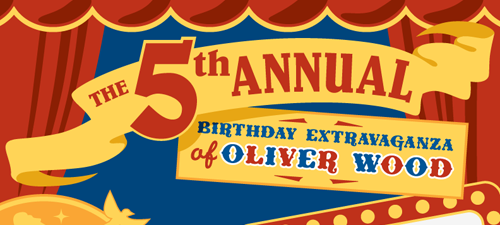 Wanting to create a kid-friendly piece focused on typography, I asked my lovely and always-inventive friend Rhiannon for an assignment. Her suggestion was to create posters for a child's party in different themes. I thought this perfect and began immediately, and so this carnival-styled poster is the result. Hope you enjoy, and I might just have another one coming down the pipes soon enough...
Extraordinary Voyages
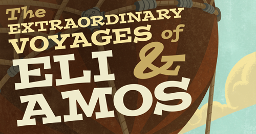 Here's something new! Well, sort of. I wanted to do some new typographic work, and expanding on the "Circumnavigate" piece seemed a perfect opportunity. I'd love to use the illustrations already finished to create further adventures for the duo, woven together to create a children's book. For now though, I hope you'll enjoy this piece. :)
Geekbox Podcast
I'm proud to add these pieces to my Design work. You can read the full story behind their creation below the fold.

Sadly, at the beginning of this month about two-thirds of the editors of 1UP.com--my preferred source for gaming info--and their sister magazine EGM were laid off by their parent company Ziff Davis. One of the highlights of 1UP was its podcasts, which gave a voice and identity to the editors. They became people you related to, a sort of friend-you've-never-met, and let listeners feel it was OK to be fully immersed in gaming and its unique culture. So, suffice to say, it was a pretty hard blow to the community to see these people lose their jobs.
Almost immediately afterwards, however, many of those cut loose by Ziff refused to roll over and wished to maintain their connection with their loyal followers. Schemes were hatched, plans were made, and ultimately brand-new podcasts were created. Several formed Rebel FM as part of "Eat. Sleep. Game." while others started "Area 5" to house their new video podcast CO-OP.
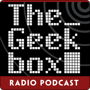
Still others worked on another podcast, which brings us to the point of this post. Ryan Scott, previously a part of 1UP's CGW/GFW Radio and its successor LAN Party, decided to keep the dream alive by starting up The Geekbox podcast, suitably named after its home base at "The Geekbox."
Living frugally as I am, I thought that instead of donating money to support these endeavors I could donate my artistic skills. After whipping up a banner I sent it off to Ryan saying to feel free to use it or not. I'm glad to say he happily adopted it for the podcast and asked for a square rendition that would basically serve as the album art. It's incredibly exciting and rewarding to see one's artwork on the iTunes music store, and to have a shout-out in the podcast, and for that I say to Ryan: THANK YOU!
Nick Mag Page Layout
 I actually did this a month or so ago, but very recently went back to implement some changes after getting some solid feedback from friends I had showed it to. This is just an example to show page layout skills; it was pretty enjoyable to work on this, so I may end up doing more layouts for different types of magazines.
Winter Blues Ad
 The most recent advertisement finished for CCRA's clinical study campaign. It's a minor variation of the
 Depression advertisement. The toughest part was managing to fit all the text that was required; it was a good challenge though.
