Alongside a few subtle tweaks to the site design, we're also rolling out today the Design section, with a few brand-new pieces made over the past few weeks. Two of them are part of a future ongoing personal design challenge in establishing "companies" for some of the monsters of the Monster Hunter universe. "Sunsnug Isle" was just something done for fun as a break from them. Check them out and let us know what you think!
Ch-ch-ch-ch-change
After extensive work developing our re-branding of Glass Jaw Studios over the past month or so, today marks the soft launch of Oak & Mint Creative at oakandmint.com. We've expanded our purview, and with it we will be sharing examples of new avenues of work we'll be tackling. These will be added as new pages in the coming weeks, but for now we can share the things we're most proud of in our main fortes.
Examples of our animation and graphic design work are next on the agenda, so stay tuned for those. We also aim to add a storefront so prints and other such merchandise should eventually be made available. Thanks for visiting and check back in again soon!
Fantasy UI
Wanting to showcase more involved user interface artwork, I decided to come up with a mockup showing a potential different look for Skyrim's UI. I actually really enjoy Skyrim's vanilla design! But it was a pretty marked departure from its predecessor Oblivion's, so I made something that would bridge the gap—strongly evoking Oblivion's wood and paper, but more Skyrim in its rough-hewn, dirtier fashion. The UI's design is based on SkyUI rather than vanilla Skyrim, with some tweaks.
Flat UI
Keeping on the user interface train, here's something I made to play with doing a flat UI. I wanted something as clean as possible with some character present via color.
Quick Social/Mobile UI
Random quick UI stuff I made because why not?
Tumblr Update
I've revamped my tumblr with an actual logo and reasonably thoughtful design! And more importantly, I'm actually somewhat regularly using it, now that I'm participating in the Pokeddexy Challenge. I've got a bit of catching up to do since the weekend was busy, but I'm having a lot of fun with this drawing challenge. So here, have my Scyther animation from Day 1 for a taste!
Pokemon UI teaser
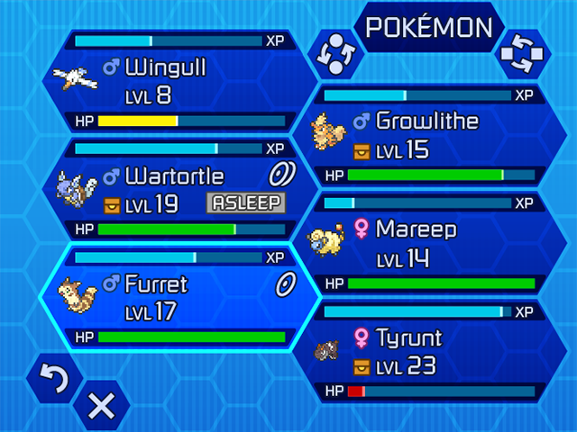
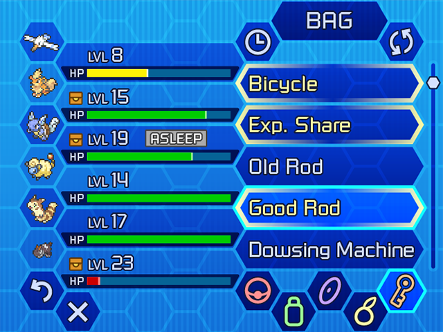
I started playing Pokemon Y back in October, and while I'm playing less of it now, it still occupies my thoughts. Some of the things about the UI bothered me, so I challenged myself to handle it my own way. I've been working intermittently on it, but here are a couple completed [bottom] screens at double resolution to tease its progress; there are several others in the works, and hopefully at some point I can tie them all together in a working Flash demo... :)
Gael Style Test
A style test for a personal project I've been working on. This is a big nod to Jake Wyatt's illustration style, though I wanted to stay with my own linework style and not parrot his. I'll probably take the project a different way but this was a fun aside.
Gael Turnaround
Character design with finalized color study and sketches of idles from all views, for personal project.
Dragon's Crown UI
Having picked up Dragon's Crown for PS3 on release day, Some friends and I were playing together and found some quirks of its interface design in local multiplayer that are quite frustrating. One example is that going into shops, players must go in one at a time and handle tasks fullscreen. To us it was a huge waste of screen space and the players' time.
After we discussed how it could be handled differently, I decided to just mock up how I'd handle it. I like some of the elements of the UI but not all, so I thought I'd experiment with fonts, layout, and subtle iconography changes where appropriate. The artwork in general is lush though, and I wanted to keep it where it would still fit well. You can see what the actual game UI looks like in the photo below.


